
本頁內容尚未翻譯。
Short overview
Section titled “Short overview”Here is a quick mapping of some colors in custom theme JSON files.
Many colors follow the Material Design 3 color roles. Some colors have specific uses in Symfonium to allow more theme variations:
- surface: Default background.
- surfaceContainer: Navigation bars and the compact player’s default color.
- surfaceContainerHigh: Dialog backgrounds, bottom-sheet headers, cards, and overlay backgrounds when used with alpha.
- surfaceContainerHighest: Snackbars.
- surfaceContainerLow: Shortcuts, some buttons, missing-image backgrounds, and filtered libraries.
- surfaceContainerLowest: Bottom-sheet background.
- outlineVariant: Default Material Design 3 roles and, when used with alpha, the currently active row.
- onSurfaceVariant: Default Material Design 3 roles and, when used with alpha, subtitle text.
Theme framework
Section titled “Theme framework”The Symfonium interface consists of several components, such as a search bar. Each component contains individual elements, such as the search bar background and text. Every element has an assigned color role. In the custom theme JSON file, you define the exact color value for each role. Those values determine the colors of the elements and the overall appearance of each component.
The Symfonium interface consists of components, which contain one or more elements. Each element is assigned a color role with a specific color value.
Components
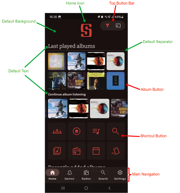
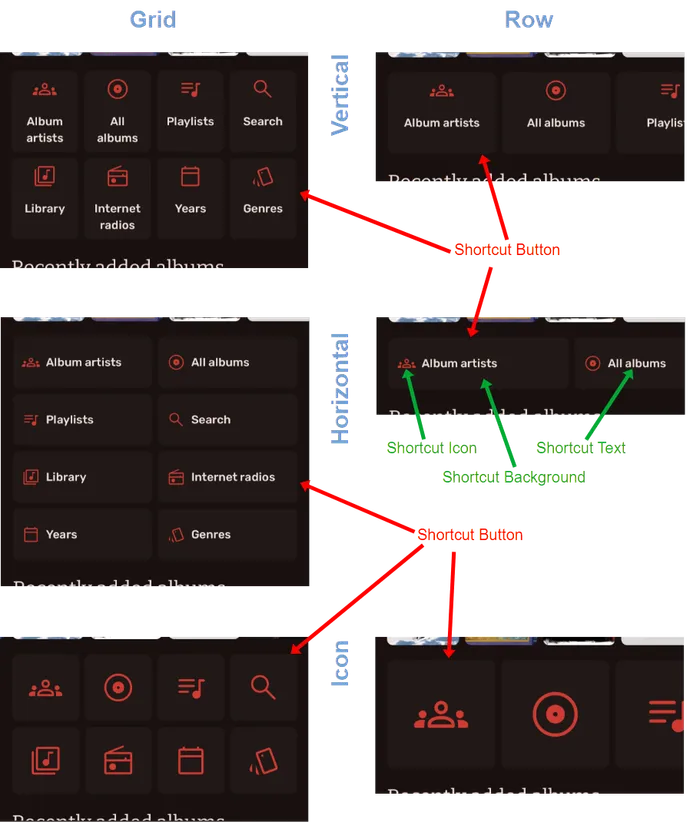
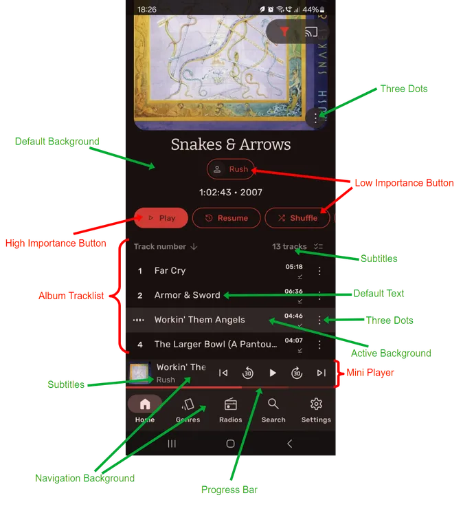
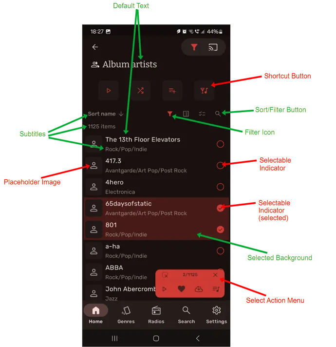
Section titled “Components”The following screenshots label components in red and elements in green. Elements belonging to a component are not always shown in the screenshots, but they are listed in the components table.
Some screens are configurable and may look different depending on your settings, especially the home screen. Labels in the tables remain in English so they match the annotated screenshots.
Home screen and main navigation
Section titled “Home screen and main navigation”The home screen consists of sections with an optional heading and a media list. You can configure the list layouts and shortcut buttons, but the same elements are used in every layout.
The main navigation is normally always visible, except in settings or when disabled. It appears in a container above the main app content.
Home screen media and shortcut button display styles
Section titled “Home screen media and shortcut button display styles”The same elements are used across the different home-screen section layouts, as shown side by side below.
Album view and mini player
Section titled “Album view and mini player”In addition to the cover image, the album view contains buttons and the track list. Like the main navigation, the mini player appears above the main app content.
List view and selections
Section titled “List view and selections”Artists, albums, genres, and other media can be displayed in configurable lists. The same elements are used in different layouts. When you select list items, an action menu appears above the list content.
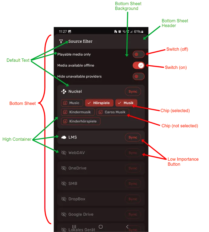
Bottom sheets
Section titled “Bottom sheets”Bottom sheets contain contextual information or menus. They temporarily slide over the app, including the main navigation.
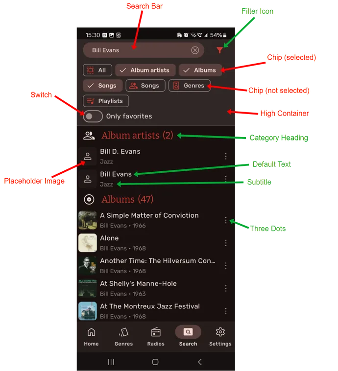
Search screen
Section titled “Search screen”The search screen contains the search area at the top and the results list below it.
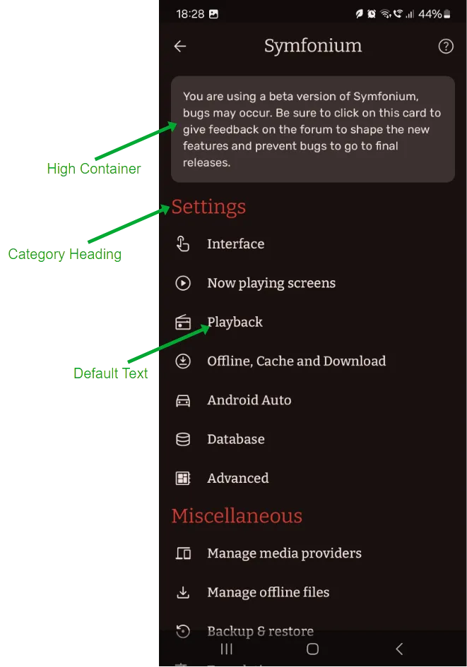
Settings
Section titled “Settings”Settings pages mostly consist of structured text lists with switches or selectable items. Some items can also be reordered.
Lists of components, elements, and color roles
Section titled “Lists of components, elements, and color roles”The following tables show the relationships between components, elements, and color roles.
Components (element groups)
Section titled “Components (element groups)”Individual elements are grouped into components. Select an element to jump to the elements table and see its assigned color role.
| Component | Consists of elements |
|---|---|
| Defaults | |
| Chip | |
| Shortcut Button | |
| Placeholder Image | |
| Album Button | |
| Top Button Bar | |
| Main Navigation | |
| Drag-and-drop Bar | |
| High Importance Button | |
| Low Importance Button | |
| Album Tracklist | |
| Album Details | |
| List | |
| Selectable Indicator | |
| Select Action Menu | |
| Notification Modal | |
| Bottom Sheet | |
| Search Bar | |
| Text Input | |
| Dropdown Selector | |
| Switch |
Elements
Section titled “Elements”The color role determines the eventual color of an element. Select a color role to jump to the color roles table and see every element with that role.
| Element | Has color role |
|---|---|
| Active Background | outlineVariant |
| Bottom Sheet Background | surfaceContainerLowest |
| Bottom Sheet Header Background | surfaceContainerHigh |
| Category Heading | primary |
| Chip (Selected) Background | secondaryContainer |
| Chip (Selected) Text | onSecondaryContainer |
| Chip Border | outline |
| Chip Icon | primary |
| Chip Text | onSurfaceVariant |
| Default Background | surface |
| Default Separator | secondary |
| Default Text | onSurface |
| Drag-and-drop Background | surfaceContainer |
| Drag-and-drop Button Background | tertiaryContainer |
| Drag-and-drop Icon | onTertiaryContainer |
| Dropdown Background | surfaceContainerHighest |
| Dropdown Border | onSurfaceVariant |
| Dropdown Border (selected) | primary |
| Dropdown Box Background | surfaceContainer |
| Dropdown Text | onSurface |
| Dropdown Title | onSurfaceVariant |
| HI Button Background | primary |
| HI Button Text | onPrimary |
| High Container | surfaceContainerHigh |
| Highest Container | surfaceContainerHighest |
| Home Icon | primary |
| LI Button Border | outline |
| LI Button Text | primary |
| Low Container | surfaceContainerLow |
| Lowest Container | surfaceContainerLowest |
| Navigation Background | surfaceContainer |
| Navigation Icon | onSurfaceVariant |
| Navigation Icon (Selected) | onSecondaryContainer |
| Navigation Icon (Selected) Background | secondaryContainer |
| Navigation Label | onSurfaceVariant |
| Navigation Label (Selected) | onSurface |
| Notification Background | surfaceContainerHighest |
| Placeholder Background | surfaceContainerLow |
| Placeholder Icon | onSurface |
| Play Overlay Background | surfaceContainerHigh |
| Play Overlay Icon | secondary |
| Search Bar Background | secondaryContainer |
| Search Bar Text | onSecondaryContainer |
| Select Action Background | primary |
| Select Action Icon | onPrimary |
| Selectable (Selected) Background | primary |
| Selectable (Selected) Icon | onPrimary |
| Selectable Border | primary |
| Shortcut Background | surfaceContainerLow |
| Shortcut Icon | primary |
| Shortcut Text | onSurface |
| Subtitle | onSurfaceVariant |
| Switch (Off) Background | surfaceContainerHighest |
| Switch (Off) Border | outline |
| Switch (On) Background | primary |
| Switch (On) Icon | onPrimary |
| Text Input Background | Not documented |
| Text Input Border | Not documented |
| Text Input Border (selected) | Not documented |
| Text Input Text | Not documented |
| Text Input Title | Not documented |
| Three dots | onSurface |
| Top Bar Active Icon | primary |
| Top Bar Background | surfaceContainerHigh |
| Top Bar Icon | onSurface |
Color roles
Section titled “Color roles”This list shows every color role and the elements assigned to it. The theme JSON file defines the color value for each role.
| Color role | Is assigned to elements |
|---|---|
primary | |
onPrimary | |
secondary | |
onSecondary | — |
tertiary | — |
onTertiary | — |
primaryContainer | — |
onPrimaryContainer | — |
secondaryContainer | |
onSecondaryContainer | |
tertiaryContainer | |
onTertiaryContainer | |
error | — |
onError | — |
errorContainer | — |
onErrorContainer | — |
surface | |
onSurface | |
onSurfaceVariant | |
outline | |
outlineVariant | |
surfaceContainerLowest | |
surfaceContainerLow | |
surfaceContainer | |
surfaceContainerHigh | |
surfaceContainerHighest |