
此内容尚不支持你的语言。
General settings
Section titled “General settings”Theme mode
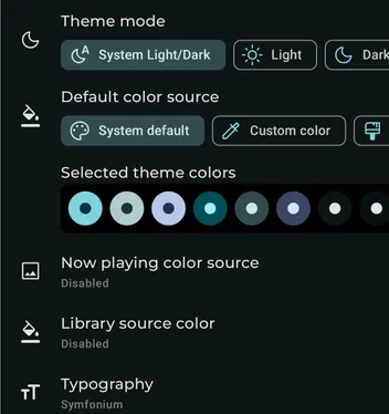
Section titled “Theme mode”Select automatic, light, dark, black, or automatic black mode.
Default color source
Section titled “Default color source”Choose where Symfonium gets its colors.
- System default: Use the Material You theme on Android 12 and above.
- Custom color: Select a source color and let Symfonium generate a theme from it.
- Custom theme: Apply a theme that defines each color separately, either imported or created in Symfonium.
Now playing color source
Section titled “Now playing color source”Choose how a color extracted from the currently playing cover art is used as a dynamic color source.
Ignore background and surfaces
Section titled “Ignore background and surfaces”Do not update background and surface colors when applying dynamic colors.
Instant color updates
Section titled “Instant color updates”Skip animations when applying dynamic colors. This can reduce lag on lower-end devices.
Selected theme colors
Section titled “Selected theme colors”List all currently selected theme colors. Click the list for a more precise dialog.
Typography
Section titled “Typography”Select the typography used throughout the app.
Custom font
Section titled “Custom font”When Custom font typography is selected, enter the exact case-sensitive name of a font available on Google Fonts.
Custom color
Section titled “Custom color”When in custom color mode, new options are available.
Seed color
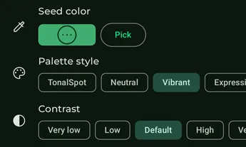
Section titled “Seed color”Press the color for a detailed color picker, or press the Pick button to select from a list.
That color will then be used to generate the theme according to the next settings.
Palette style
Section titled “Palette style”Select how the palette is generated from the selected color:
- TonalSpot: A calm theme, sedated colors that aren’t particularly chromatic.
- Neutral: A theme that’s slightly more chromatic than monochrome, which is purely black / white / gray.
- Vibrant: A loud theme, colorfulness is maximum for Primary palette, increased for others.
- Expressive: A playful theme - the source color’s hue does not appear in the theme.
- Rainbow: A playful theme - the source color’s hue does not appear in the theme.
- FruitSalad: A playful theme - the source color’s hue does not appear in the theme.
- Monochrome: A monochrome theme, colors are purely black / white / gray.
- Fidelity: A scheme that places the source color in Scheme.primaryContainer. Tertiary Container is the complement to the source color, using TemperatureCache. It also maintains constant appearance.
- Content: Tertiary Container is an analogous color, specifically, the analog of a color wheel divided into 6, and the precise analog is the one found by increasing hue. This is a scientifically grounded equivalent to rotating hue clockwise by 60 degrees. It also maintains constant appearance.
Contrast
Section titled “Contrast”Select the contrast level of the palette.
Color spec version
Section titled “Color spec version”Choose the 2021 or 2025 Material color specification used to generate the palette.
Custom theme
Section titled “Custom theme”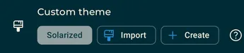
When a custom theme is selected, you can choose a predefined theme, browse the online catalog, import JSON themes for local use, or create a theme directly.
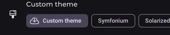
Imported or created custom themes can be edited, renamed, or deleted by clicking them again.
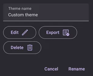
Delete removes the theme from the local database. Export saves the theme in JSON format for sharing or backup.
Edit opens the full custom theme editor, allowing you to change any color with a precise color editor and directly see the result.
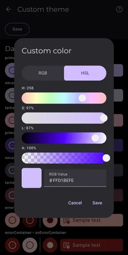
See Symfonium custom themes for the custom theme format and how to create one.